做一个动态搜索框
发表于|更新于
|字数总计:505|阅读时长:2分钟|阅读量:
前言
动态的搜索框已经不是什么稀有的东西了,因为它的动,它可以出现在任何符合它位置的地方。
今天咱也来整一个,看看效果?

大致就是最开始显示的是一个图标,鼠标移动上去的话,它就变成了正常搜索框的样子可以进行输入并搜索。
来看一下如何实现的!
开始整活
整体HTML就是一个div套着一个input跟一个a,a标签中放icon,我是复制的svg。
1
2
3
4
5
6
| <div class="search-box">
<input class="search-txt" type="text" placeholder="动态搜索框">
<a class="search-btn">
</a>
</div>
|
在这个动上面,我这里利用的是hover效果,看上面动图也能看出来,鼠标移动上去它就变长,移开他就还原了,同时将按钮的颜色更改一下是为了让用户的体验提升一点。
总体上来说,利用css中的hover,改变width,达成长度变化的效果。
1
2
3
4
5
6
7
8
9
10
11
12
13
14
15
16
17
18
19
20
21
22
23
24
25
26
27
28
29
30
31
32
33
34
35
36
37
38
39
40
41
42
43
44
45
46
47
48
| body{
margin: 0;
padding: 0;
background-color: #FF670F;
}
.search-box{
position: absolute;
top: 50%;
left: 50%;
transform: translate(-50%,-50%);
background: #2f3640;
height: 40px;
border-radius: 40px;
padding: 10px;
display: flex;
justify-content: center;
}
.search-box:hover>.search-txt{
width: 200px;
padding: 0 6px;
}
.search-box:hover>.search-btn{
background: white;
}
.search-btn{
float: right;
width: 40px;
height: 40px;
border-radius: 50%;
background: #2f3640;
display: flex;
justify-content: center;
align-items: center;
transition: 0.4s;
}
.search-txt{
border: none;
background: none;
outline: none;
float: left;
padding: 0;
color: white;
font-size: 16px;
transition: 0.4s;
line-height: 40px;
width: 0px;
}
|
好像还有别的
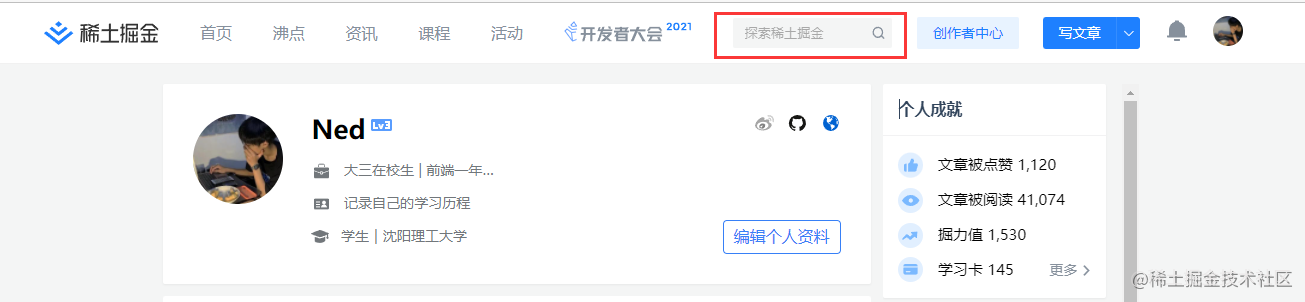
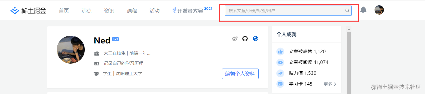
还有一种与这种不一样的动态的是,点击下去它产生变化,不明白我说的什么意思的可以去首页点击一下掘金右上的input。
点击前:
点击后:
这种效果我记得之前有一位大佬已经分析过了,所以我就不多做阐述了呀~
最后
CSS的魅力真的是太大了,努力学习吧!
 微信
微信 支付宝
支付宝